NOTE: Please use the search function above before posting to avoid creating duplicate topics.
Device model (e.g. 2020 iPad Air 4th Gen):
Version of operating system (e.g. macOS 14.4.1):
Version of djay (e.g. 5.1.2):
Hardware/controllers used (e.g. Reloop Mixon 8 Pro):
Hardware firmware version (e.g. 1.0.1):
Please consider sharing a short video or screenshots to help clarify your question
YOUR QUESTION:
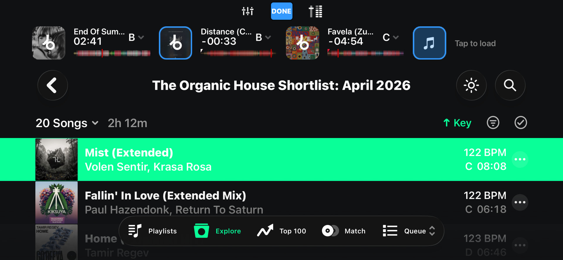
Hi guys!!! I have a new residency this summer on the beach in Greece. From afternoon till closing. I wanted to try djay pro and bought a reloop mixon controller. All good…But when i try to select songs from the controller, all the titles get a bright green fill and this makes the titles unreadable, specially in the sun. But even at home i cant read it. I can read it when scrolling with my finger on my iphone, but not when selecting from controller. Is this fixable? Can i change the color scheme a bit so this obnoxious green is gone??? See attached.
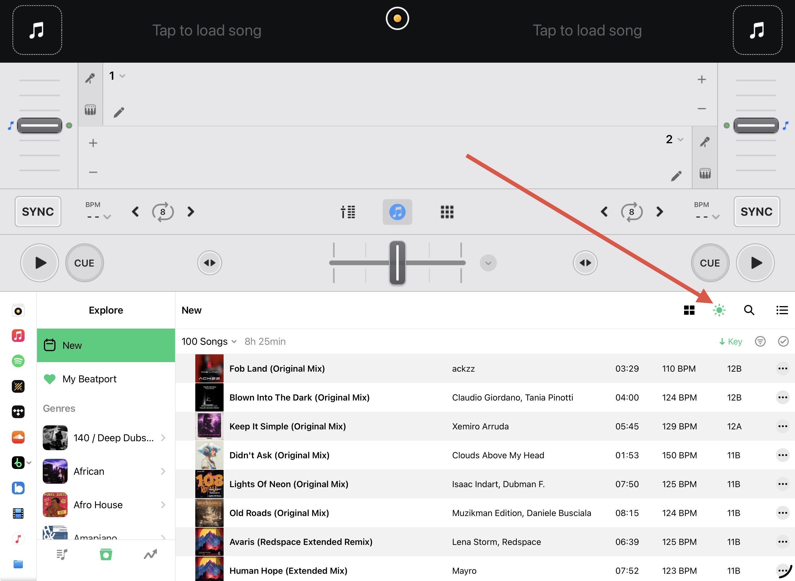
Hi @wen, thanks for sharing. You can switch the UI to Day Mode to make the text easier to read. The highlight color is drive by the source you are using and cannot be changed. Green for Beatport, Red for Apple Music, Orange for SoundCloud, etc.
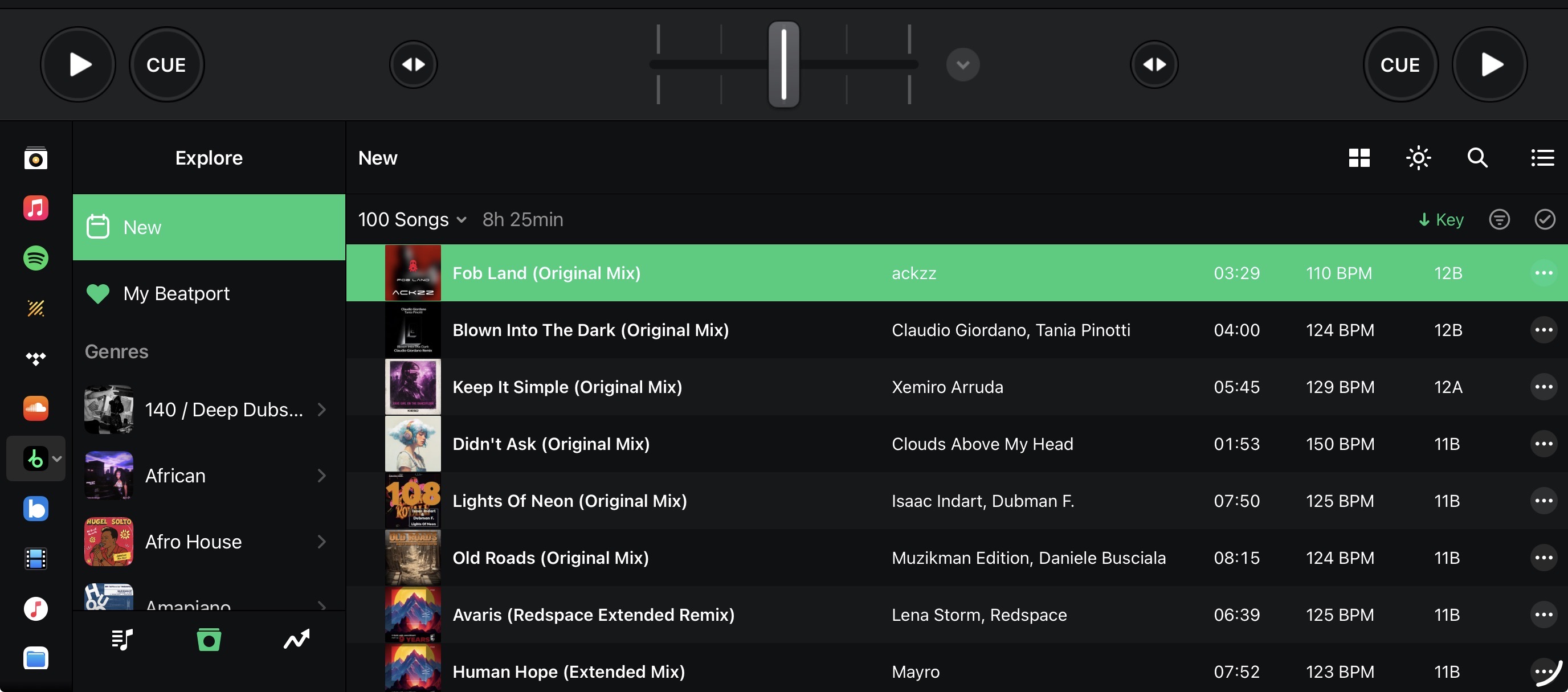
Hi again @wen, are you using some Accessibility Setting in the iOS settings that changes the colors or contrast? I’ve noticed that in regular mode on my iOS devices that there is better readability than what you are seeing.
I didn’t say it was perfect, but the contrast between the white text and green background looks better to me. Either way, there seems to be some difference between what I’m seeing and what they are seeing. Obviously Day Mode is the way to go for now at least.