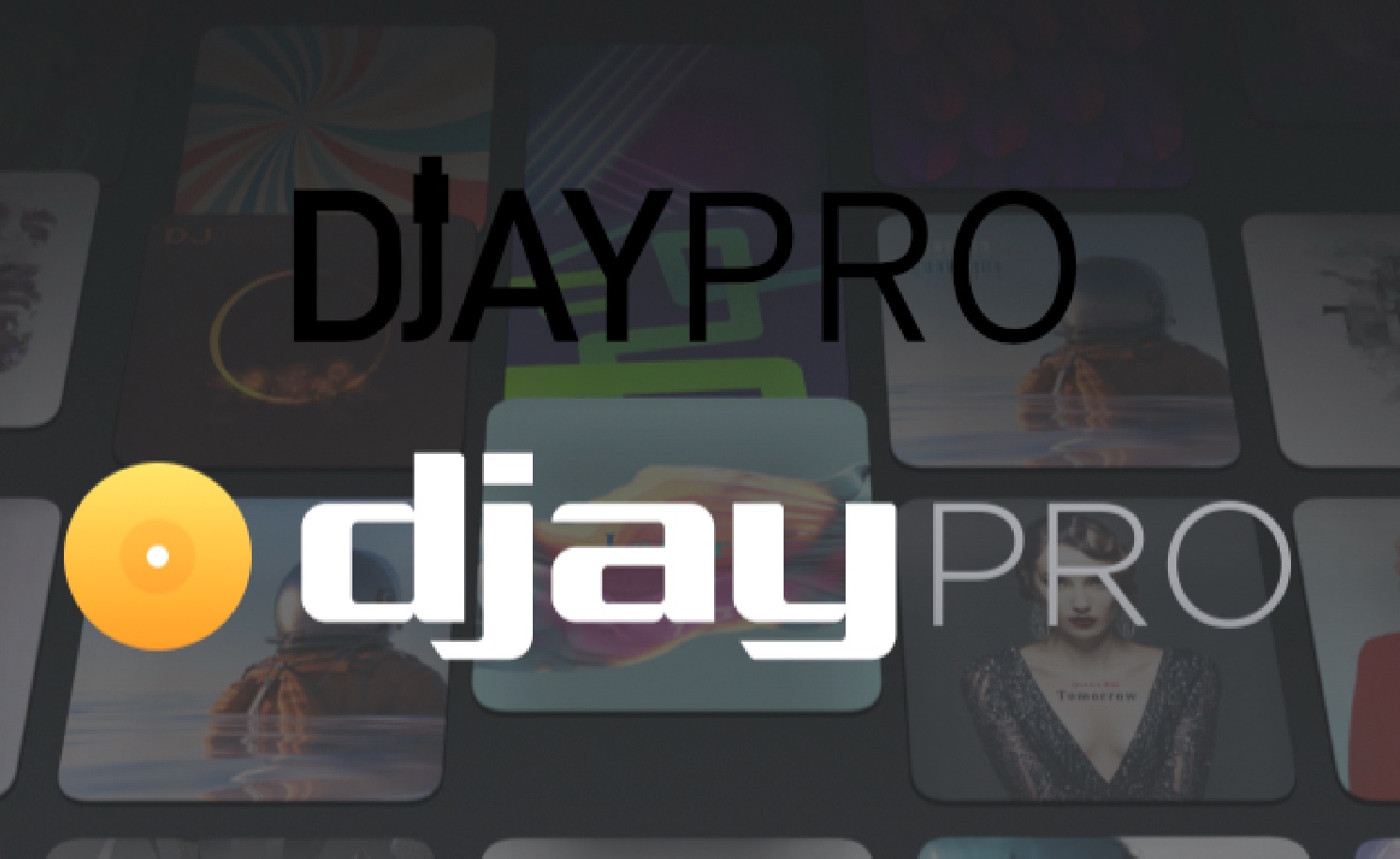
I was so angry when Traktor stopped working on their iPad Version. But now I understand. Djay Pro is far ahead. Must have been for some time but I wouldn’t know. To be honest, I am a visual guy and the font of the logo always kept me back taking Djay seriously. Yes, I said it!
Anyway, after the shock that the cue buttons on my Mixtourpro were not on point (I think I solved it now via the threads here) I found a thought through mighty app. Waiting for my next gig but I already have a very good feeling. I had a feature request list but I found nearly all I needed. One thing though: I’d love to have some visual feedback which deck is actually “on Air”. And an option to dimm the cue buttons but I guess thats Reloops part. kthx, happy to be here.
It’s down to the war of logos?
I thought we were still in the war of loudness.
Logos do make a statement, that were are us, we are different. And beneath the statement, there’s usually some hidden meaning only known to the people who sat down and agreed to it. Only minor edits are allowed to legitimate logos..
Traktor is way too geometric
Serato is eutopian - alien to be exact
djay is plain and simplistic (humble?)
Rekordbox looks like it was originally swastika
And VDJ is a vinyl in a pouch - well makes sense only that it was PCDJ Red in the beginning
I also would let developers do their job and not design anything. You wouldn’t want to see UIs created by most developers.
But there are Designers at Djay. Some design team did a tremendous job putting all these features in a understandable neat UI/UX. My guess is that it mustn’t look too professional.
But its all about opinion isn’t it, i personally like the Algoriddim logo and font, it stands out and makes it clear which brand it is from the outset, different strokes for different folks.
Yeah, its opinion and also professional criticism from my side as a designer and I bet I am not the only one. Anyway after all hthese years its out of my head finally. Cheers
I think at this point, especially in the age of the internet, there isnt a single thing on the planet (or even off the planet) that you cant find at least some people who have a problem with it. Im sure the people who run Algoriddim are happy with their choices, and the circa 14000 largely positive reviews on the App Store stand testament to that.