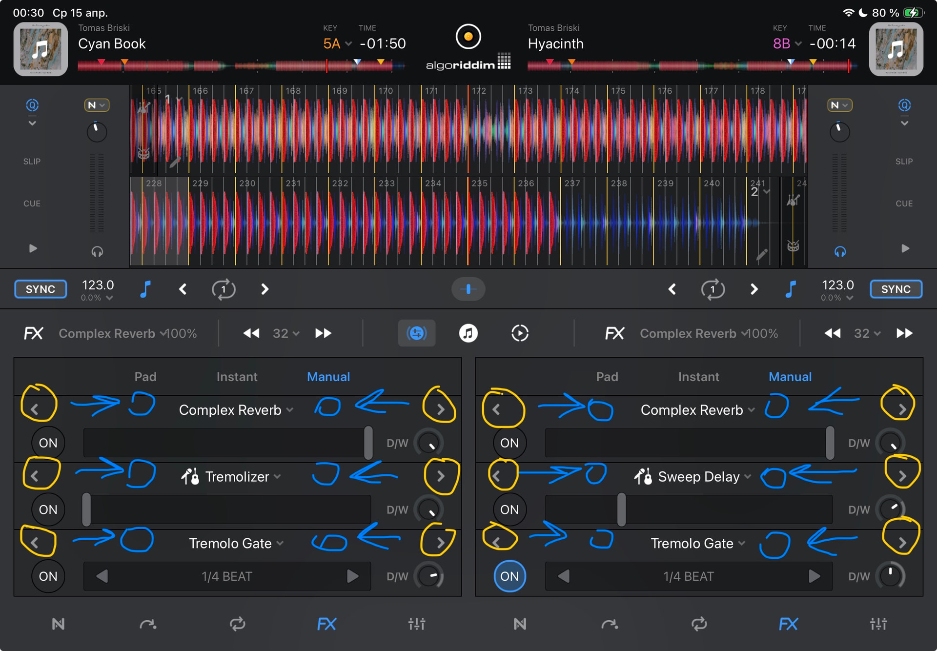
Working with effects (manual) on iPhone and iPad.
YOUR SUGGESTION:
1. Reposition the effect selection buttons.
Why?
When I want to rotate D/W, I might miss and press the effect switch button located above D/W. These elements are positioned very close to each other.
From a practical standpoint, this is inconvenient.
2. Make the D/W buttons larger.
3. Make the D/W effect dials square for more precise finger control.
4. Create a duplicate D/W level window. Currently, the finger obscures the amount of effect being added.
5. Make the effect activation buttons larger.