Hi guys, would it be possible to implement a traktor-type display system, like in photography?
ADMIN Edit for clarify:
→ Side-by-side waveform display instead of full length stacked waveforms across the top.
Hi guys, would it be possible to implement a traktor-type display system, like in photography?
ADMIN Edit for clarify:
→ Side-by-side waveform display instead of full length stacked waveforms across the top.
Hi @Screma, can you please elaborate? Perhaps using a markup tool to identify specifically what you mean by “traktor-type display system”? Thanks!
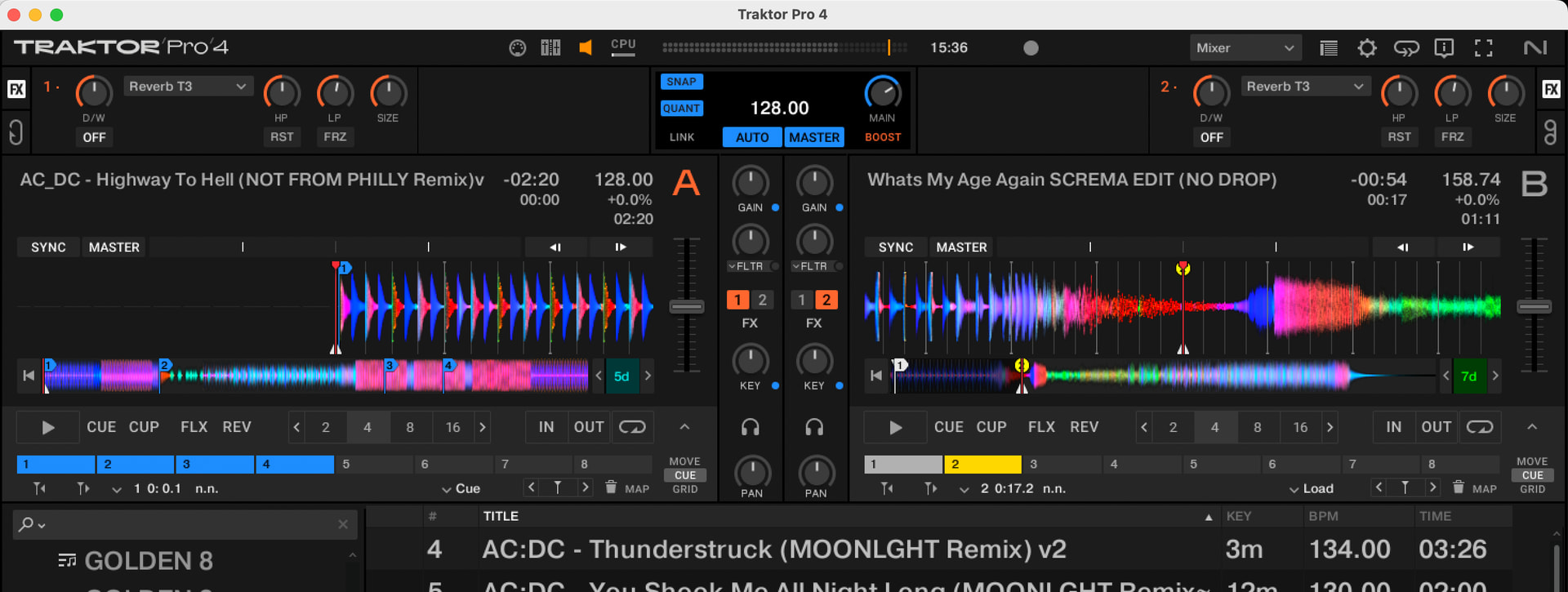
Hi… I mean the visualisation with two separate and separate decks. Without overlapping tracks.
I know what you mean, but if you want other users to upvote your suggestion, I highly recommend that you make it more clear. I especially think using the word “visualization” is confusing. Perhaps layout, orientation, position or user interface (UI) would be better.
I upvoted this as I’ve come from Traktor so know exactly what you mean. @Slak_Jaw is right though I think maybe haven’t explained clearly.
Definitely down for the implementation, would need a phase meter as well though
Sorry, my English is poor, and I’m probably thinking too much in Italian ![]()
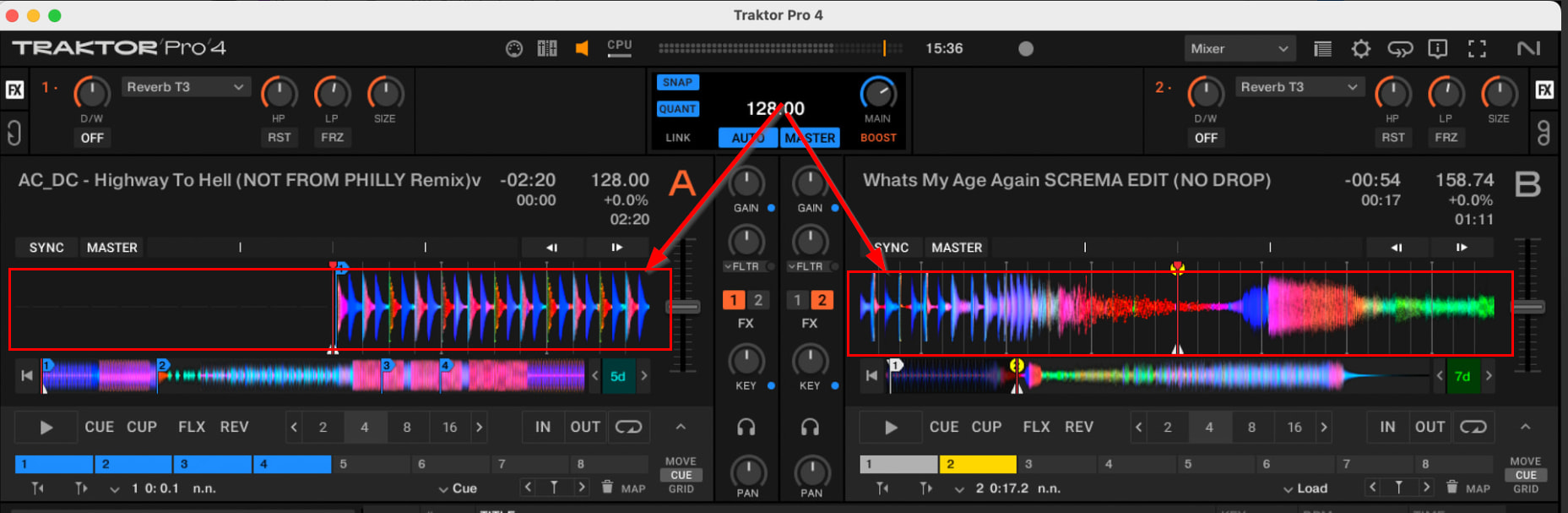
I mean, the display, exactly as it is in Traktor, is very good. For example, the hotcue bar remains thin and low, taking up very little space, unlike the giant buttons we have now.
I don’t know how to go into more detail now. There’s a very clear photo; just copy it, or open Traktor, look at the layout, and you’ll see that many things are more functional… I’m really hoping to finally switch to DJ Pro, but right now, some things are a bit cumbersome.
For me it would be better like this photo that I posted in the first post and that I’m reposting below… (I’m starting to wonder if it can’t be seen at this point…)
I’ll post one so you can see what I mean better…I’ll attach it here on this post. The hot cues are also nice and visible like this.
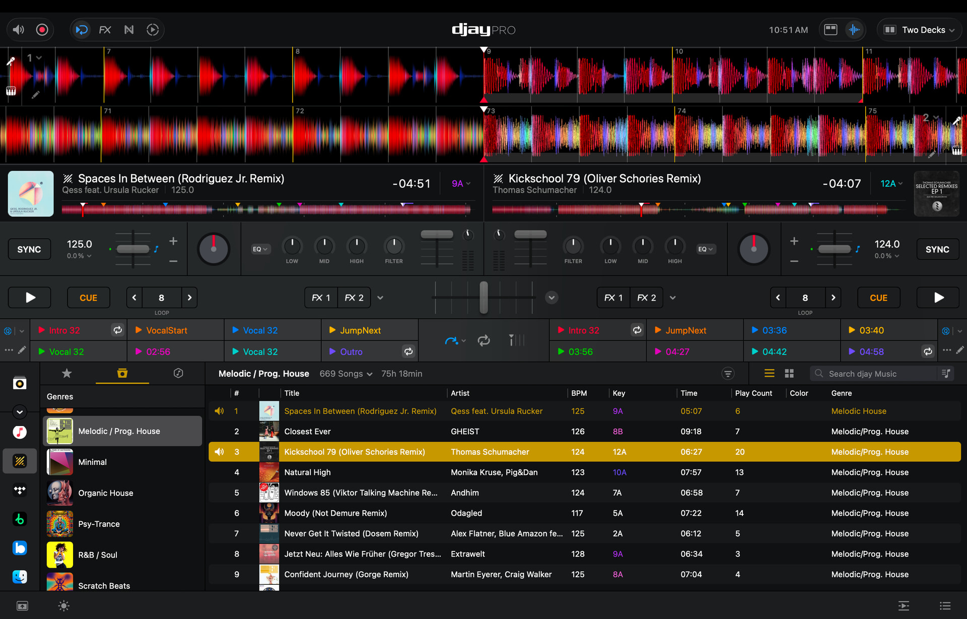
So you want split side by side waveforms instead of stacked across the top?
exactly like this… but with the track information in the same way, same thing for the cues
If you look at my screenshot above you will observe the smaller Hot Cues below the waveform - similar to Traktor
So the only big difference I see is the side-by-side waveforms:
Yes, exactly. I actually didn’t keep that section open there, because since the library doesn’t expand, I kept as few options as possible on the desktop to have more of a library.
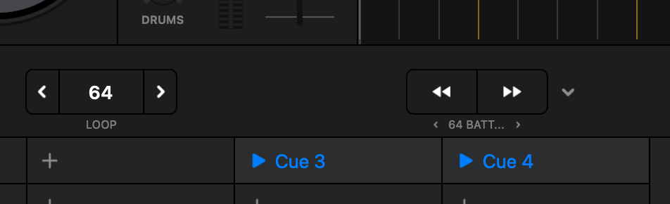
Another thing, I think it would be useful to highlight the number of selected beatjumps more clearly, because it’s really small right now…
Thanks for clarifying @Screma. I’ve adjusted the topic title to make your suggestion more clear. I will share this with our dev team for consideration.
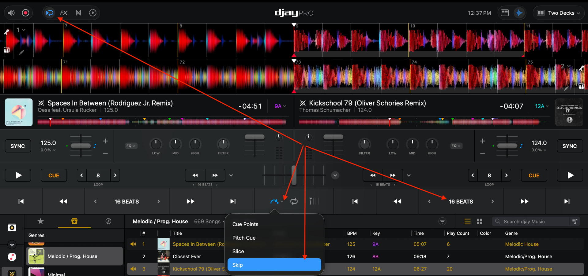
@Screma, if you want the beatjump controls to be more visible you can change to the Skip View:
Yes but in that case I lose the hotcues. What I meant by Traktor is that hotcues are always visible, and loops and beatjumps are always coincident and above all clearly visible.
Got it. Thanks for the additional info.
@jaysnbrwn, @Screma, @Michael_Wisniewski and @Frank_Bash, our dev team would like you to please confirm your rationale for preferring the side-by-side, split waveform view option. Are there some specific advantages over the full length, stacked waveform view? It would be very helpful for them to understand the specific reasons behind this preference. Thanks again!
First of all, thanks for your consideration. It’s nice that a community has this kind of support from the development team; it’s not easy to find.
So, I think of it as a matter of convenience, as in the view I posted, you can clearly see a lot of track information, you can see the track in its entirety, with well-defined master tempos (which help a lot), you can clearly see the loops and beatjump values, you can see the hotcues, and above all, the two tracks are separated into left and right. For those who use controllers like the D2, Native X1, or AllenHeat K3, for example, having the two tracks clearly separated between left and right helps a lot in preventing inadvertently pressing the wrong button, but even those who use classic jog dials can get confused by the overlapping tracks. In fact, many use the vertical view precisely to have the two tracks separated between right and left, but unfortunately that type of view does not allow a view of the scrolling track, beyond 4 bars in general, while in the case of Traktor for example, you can see up to 12 bars, with standard zoom…
You’re welcome @Screma. Thanks for the additional explanation - I’ve shared this with our devs.