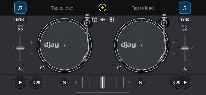
CUE & Play buttons are overlapping on the right deck in classic view on the new update.
Hi @Leigh_Brown,
Thanks for sharing that post!
So that I can better assist you could you please answer the following questions:
- What version of iOS are you using?
- Does this UI issue happen every time you load up the app?
- If you change the buttons from CUE to Jump/Start in djay’s settings and back does this issue still occur?
Happily awaiting your reply!
I normally have mine set to Set / Jump and not Cue, but have just changed it to check and mine does the same.
iPhone 14 Pro Max, iOS 16.1.2, Djay 4.1 so all the latest updates etc.
The other option is all fine.
To answer @NathanielAlgo’s questions, it’s yes, every time and switching back and fore between modes results in the UI issue every time.
Just thought I’d add to the thread to say it’s not just @Leigh_Brown who has the issue, although as I don’t use it, I wouldn’t have known……
![]()
Hi all,
I wanted to let you know that this issue has been fixed in the latest version of djay to be released, v4.1.1, as of a few hours ago.
Thank you all for your patience while this was being fixed. Have a good day!
This topic was automatically closed 365 days after the last reply. New replies are no longer allowed.


