DDJ-XP2 with four decks is confusing

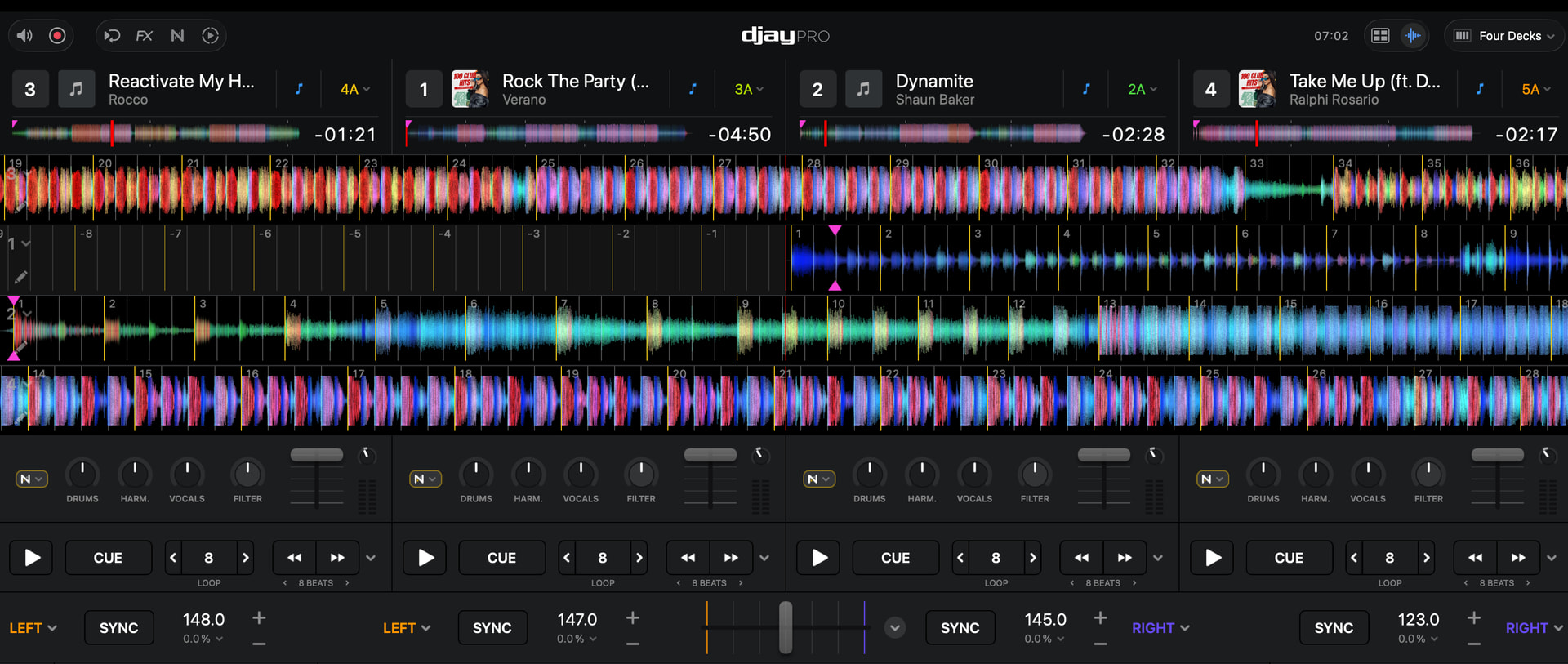
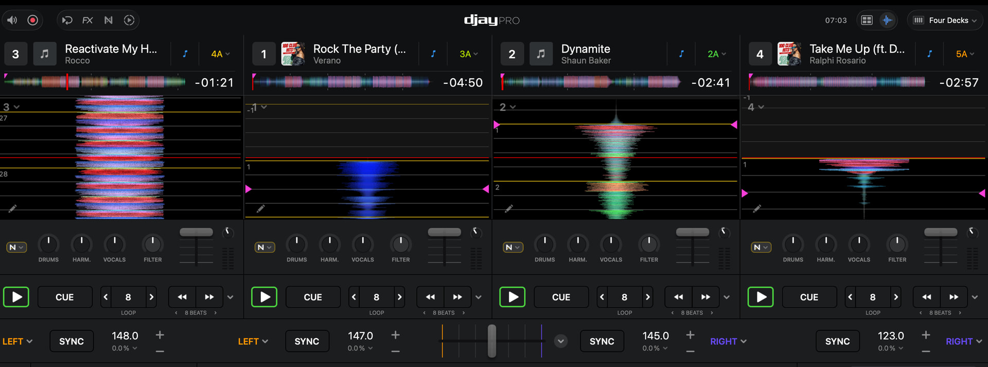
I’m making mistakes (starting / stopping the wrong deck) while using four decks with my DDJ-XP2 since there is no indication in Djay which deck is selected.

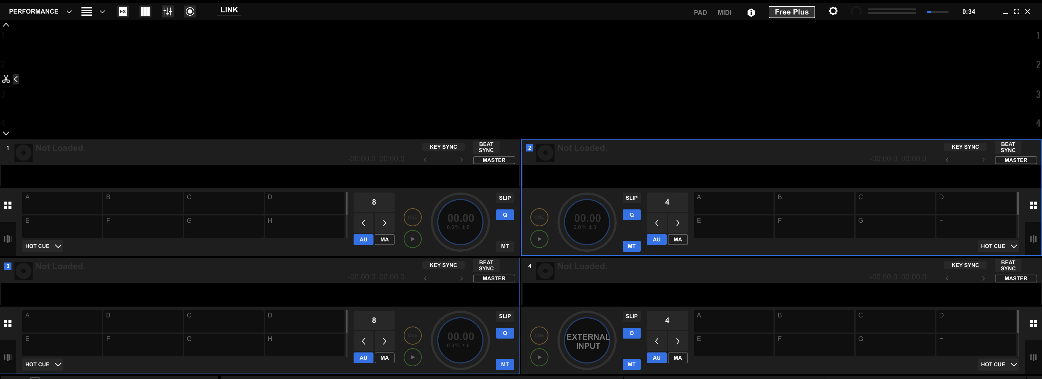
In rekordbox there is a blue thin line around the selected deck.

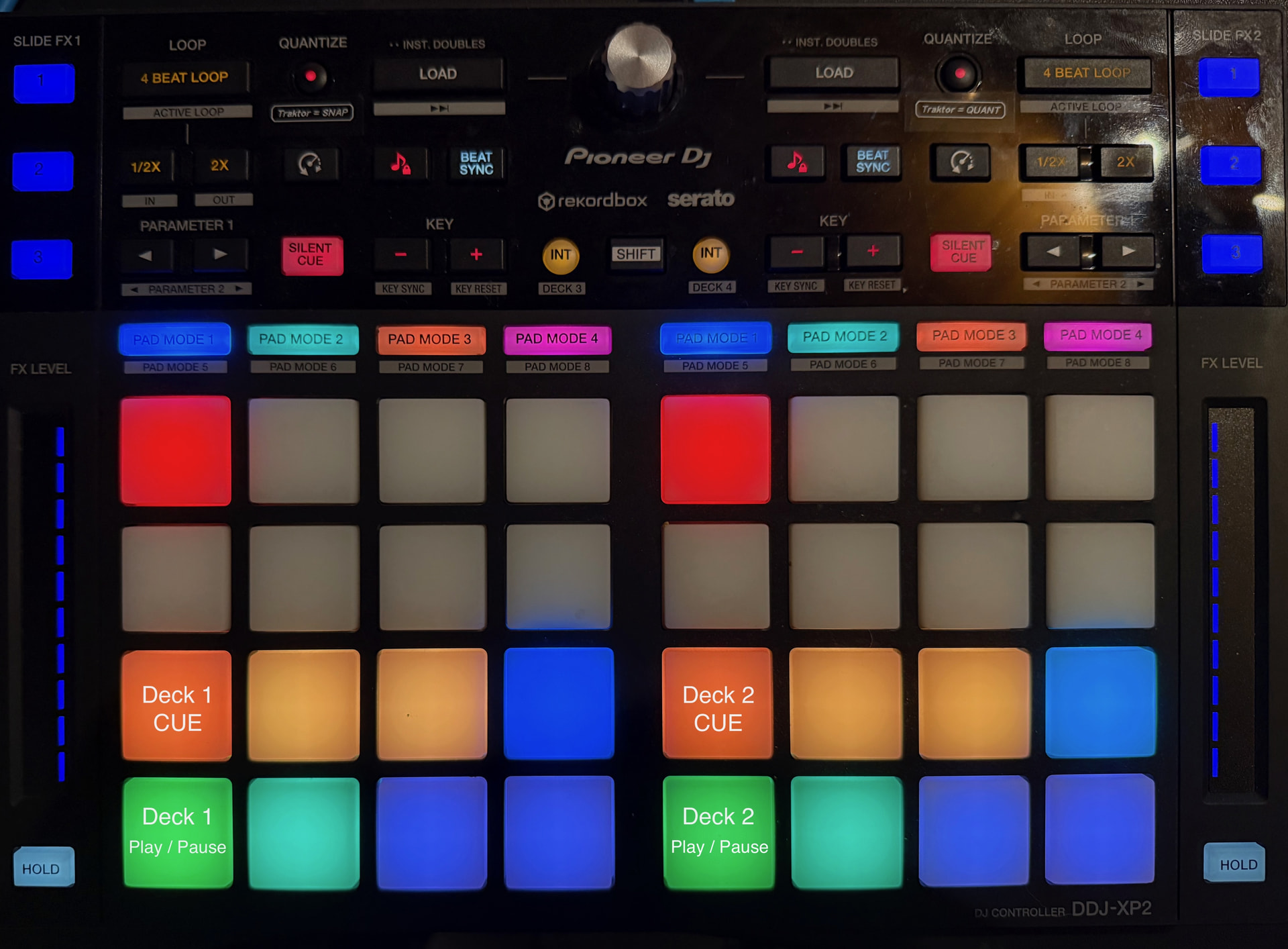
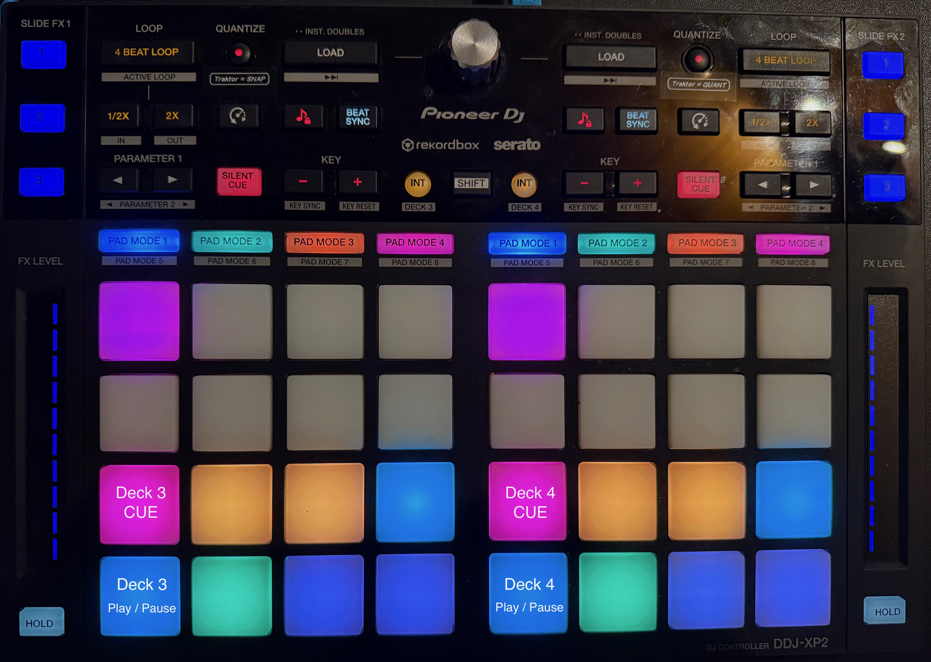
See screenshots.

Can this be fixed?

Nobody familiar with this issue? It isn’t DDJ-XP2 related only i realise now. I have an DDJ-FLX-10 as well. Every DJ with a controller which needs to switch by a button from deck 1 to 3 and deck deck 2 to 4 must struggle with this.

Hi @djbo, thanks for the screenshots, and sorry for the slow reply. You’re right, and it isn’t specific to the XP2. djay doesn’t currently track or show which deck a controller’s deck-switch button has selected, so there’s no on-screen highlight like the one you’re used to in rekordbox. Right now that state only lives inside the controller.

There’s already a suggestion for exactly this, so I’ve merged your topic into it: Add visual indicator for selected deck. Please give it a vote. It helps us show the team how many 4-deck controller users are running into this.

In the meantime, can you use the deck-select button lights on the XP2 and FLX10 as your check before hitting play or stop?

The suggestion to check the deck-select lights before pressing Play is a useful workaround but it still leaves room for human error. The underlying problem is that switching between Decks 1/3 and 2/4 requires the DJ to remember or visually confirm which deck is assigned to the transport controls. An on-screen highlight would help but it introduces another visual check that can easily be missed during a busy four-deck performance.

A possible improvement is to use the existing left and right Play buttons, or nearby RGB performance pads, piggybacking on their LED functionality to provide binary deck identification: Left Play Button Blue = Deck 1, Right Play Button Blue = Deck 2, Left Play Button Red = Deck 3, Right Play Button Red = Deck 4. The LEDs would change colour automatically to reflect the actual deck assigned to each transport control, providing immediate visual confirmation at the point of operation rather than requiring another glance at the screen. This wouldn’t eliminate every possible mistake but it could substantially reduce deck-selection confusion.

Hi Slak_Jaw, Voting is closed for that topic.

The deck-select button lights on the XP2 give no indication weather i’m in deck 1 or 3 / 2 or 4 pressing SHIFT >" INT" (round buttons left en right the ‘shift’ button). This is the same in rekordbox and Djay. Just checked it out since i have a spare XP2 at home (the other one is in the club). So that isn’t going to prevent the confusion.

Probably it is on the FLX10, but i can’t check that now and i hardly use my FLX10.

By the way, just found this topic > 4 Deck Switching (FLX10). Indeed, the request from the topic starter is what i also would like to see in Djay, but voting also closed for that topic.

Thanks four sharing your idea! I let in sink in for a an afternone and have done it now. This solves my problem!

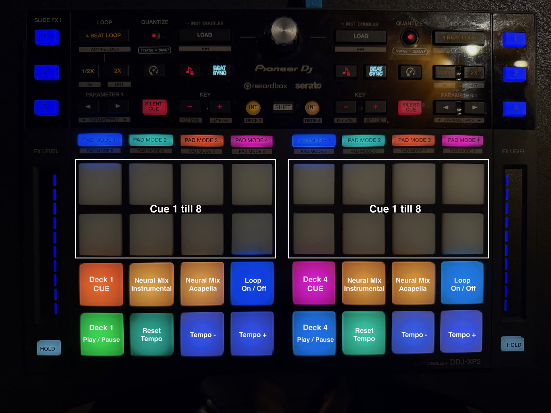
See picture in attachment which is showing Deck 1 left & Deck 4 right.

I kept the the colours for the CUE and Play / Pause buttons orange and green on Deck 1 & 2 and changed the CUE and Play / Pause buttons from Deck 3 and 4 in pink and light-blue (on the picture it looks dark blue, but’s it’s not).

Hi @djbo, I’ve reopened both topics.

That’s great to hear! I’m really pleased the idea has solved your problem.

What I particularly like is that you’ve adapted it to suit your own controller and workflow. Once your brain associates each color with its corresponding deck, identifying the active deck becomes almost instinctive. Instead of having to stop and think about which deck is selected, you get immediate visual confirmation.

It’s a small change with a potentially big payoff in confidence and reduced human error. Well done for taking the idea and making it work for you!

Thanks. It’s super easy now. I’ve been practising for half an hour and never made a mistake again.

That’s so positive to hear! It’s amazing what such a simple change can achieve.

Do you find that you’re spending less mental energy thinking about which deck you’re controlling, leaving you more freedom to enjoy the mix, have fun and be creative?

Your pics say deck assignment fully verified before hitting play or cue.

Yes I do.

I have so many buttons to handle (see link below) that it is a relieve now. :slight_smile:

Thanks for the photo. Great to see your setup. I’m glad the binary colour tip was useful.

One refinement I’ve been working on is eliminating those outline or glow states on performance pads and buttons. A pad or button is simply off or on, with no fuzzy middle.

This is part of a broader design principle I’ve been exploring called grey-space reduction.

Grey space is the small but significant mental gap between seeing a control and knowing exactly what it means. It’s the moment of uncertainty where your brain has to interpret something before you can act.

The idea is to progressively remove that uncertainty:

  1. Remove visual ambiguity – make every state immediately recognisable.
  2. Reduce interpretation – eliminate unnecessary visual cues that compete for attention.
  3. Reduce decision time – make the correct action obvious without conscious deliberation.
  4. Reduce cognitive load – free up mental capacity for listening, timing and creativity.
  5. Strengthen muscle memory – establish consistent, predictable relationships between controls and their behaviour.

A glowing outline might look attractive, but if it makes you wonder whether a pad is selected, armed or active, it introduces grey space.

The aim isn’t simply a cleaner interface. It’s a more direct connection between intention and action.

Less interpreting. Less hesitating. More performing.

In a live performance, even a fraction of a second of unnecessary uncertainty matters. The less attention the interface demands, the more attention you can give to the music.

Thanks for the ideas @RickVincent. Super helpful!

I see what you mean. How have you been working on it? Did you find a trick in Djay to get rid off the fuzzy middle?

Grey Space Reduction: A Practical MIDI Mapping Example

Reloop Mixtour Pro | Rick Vincent Design Philosophy

1. Identifying the Problem

While developing my Reloop Mixtour, I identified an opportunity to improve the visual clarity of four transport and function buttons on each side of the controller.

These buttons are:

  • Play/Pause
  • Cue
  • Sync
  • Loop

My objective was to eliminate unnecessary illumination states while retaining visual information essential for identifying the selected deck.

This is a practical application of my Grey Space Reduction (GSR) philosophy.

2. Examining the MIDI Mapping

Using djay Pro’s MIDI mapping editor, I examined the MIDI Out values controlling the buttons’ illumination.

Some mappings used the following values:

MIDI Out Value

Visual Result

0 LED OFF

2 Blue outline illumination

6 Solid blue

The original minimum value of 2 produced an illuminated outline.

For controls that required only an ON/OFF indication, this introduced an unnecessary intermediate visual state.

I changed the minimum MIDI Out value from 2 to 0, retaining the maximum value of 6.

This allowed the relevant buttons to communicate their status through two distinct conditions: completely OFF or solid blue.

3. Applying GSR to the Four Buttons

Importantly, I did not apply the same illumination behaviour to every button.

Each button was assessed according to the information it needed to communicate.

Play/Pause — Permanently Solid Blue

The Play button remains solid blue to provide immediate deck identification.

Its illumination is not intended to indicate whether playback is running.

Playback is already confirmed visually through the moving waveforms on my iPad.

There is therefore no need to duplicate playback-status information through the Play button’s illumination.

Cue — Blue Outline Retained

I deliberately retained the blue outline around the Cue button.

This provides a secondary visual reference for identifying the active deck layer.

Without this additional reference, the solid blue Play button alone could create uncertainty about the current deck assignment.

In this instance, the outline serves a specific purpose and is therefore retained.

Sync — Binary ON/OFF

The Sync button requires only two visual states:

  • OFF — Sync inactive.
  • Solid blue — Sync active.

The unnecessary outline state was eliminated by changing the applicable minimum MIDI Out value from 2 to 0.

Loop — Binary ON/OFF

The Loop button follows the same principle:

  • OFF — Loop inactive.
  • Solid blue — Loop active.

Again, the intermediate outline state was eliminated.

4. The Significance of This Improvement

This example demonstrates an important distinction within my philosophy.

Grey Space Reduction does not mean eliminating every intermediate visual state indiscriminately.

It means evaluating the purpose of each state and eliminating those that introduce unnecessary interpretation.

On my Mixtour Pro

  • Play provides permanent deck identification.
  • Cue provides additional layer confirmation.
  • Sync communicates its operational status.
  • Loop communicates its operational status.
  • The iPad waveform confirms whether the deck is playing.

Each indicator has a defined responsibility.

Information is retained where it serves a purpose and removed where it creates unnecessary ambiguity.

5. Hardware and Software Working Together

This improvement required no physical modification to the controller.

Instead, I examined how the software’s MIDI output values controlled the hardware’s existing illumination capabilities.

By making targeted changes to the MIDI mapping, I improved the clarity of the physical interface.

This demonstrates why a comprehensive assessment must consider both controller hardware and its software interactions.

The objective is not simply to make the controller(s) look cleaner.

It is to ensure that every visual indication communicates useful information immediately and consistently.

6. The Philosophy in Practice

The underlying principle is straightforward:

Every illuminated state must have a clear purpose. If it provides no useful information, eliminate it. If it prevents uncertainty, retain it.

The result is a more deliberate visual hierarchy in which the DJ can distinguish deck identification, layer confirmation and operational status without unnecessary interpretation.

This is Grey Space Reduction in practice.