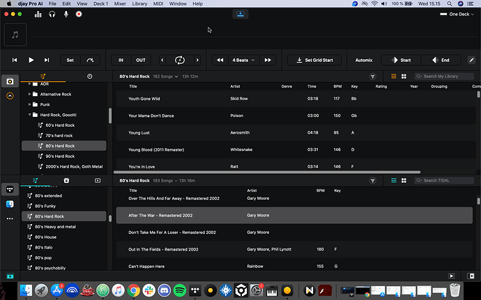
Current way of showing local playlists and playlists from streaming services aren’t very optimal.
You can see very limited amount of playlists and limited amount of songs on them.
Drag & drop songs from bottom to up is easy, but dragging and dropping a full playlists from bottom (tidal) to local playlist tree is too difficult to get it into correct place.
What I would like to see is “side by side” new “LIBRARY MANAGEMENT” view.
So
- more playlist can be seen
- more songs from each playlist can be seen
- dragging and dropping (a song, songs, a playlist) from left to right is easier to get it to correct place
And of course filter / search tools for streamed and local playlist would be nice.


